
Start With Visual Hierarchy
Choose What Should Be Seen First, Second, and Third
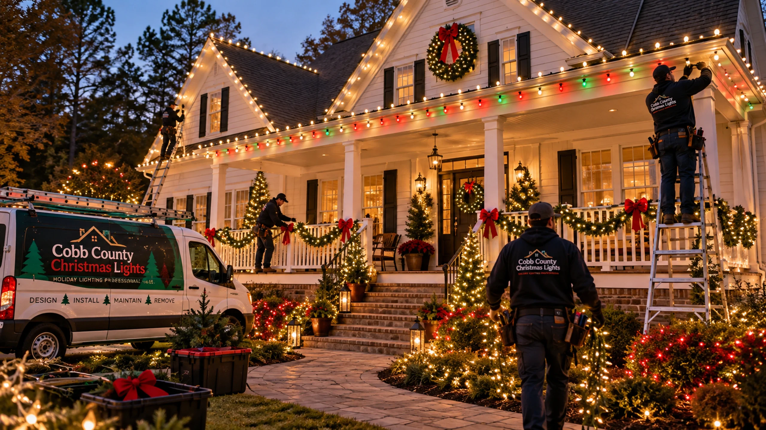
A strong holiday lighting design usually has a clear hierarchy. The largest architectural lines or most important viewing angle establish the display, secondary features add depth, and smaller accents finish the composition. When every surface is treated as equally important, the display can become visually busy and harder to read from the street.
For many homes, the main roofline or front-facing architectural shape becomes the primary layer. Trees, pathways, landscaping, columns, or porch areas then support that structure. On commercial properties, storefront lines, entrances, high-visibility trees, or gathering spaces may take priority depending on how customers and guests approach the property.
Architectural Lighting
Use the Building Shape to Create Structure
Roof edges, peaks, eaves, columns, railings, storefront lines, and entry features can create the strongest framework for the display. The goal is not simply to trace every available edge. Instead, choose the lines that define the property best from the main viewing areas.
Repeating a consistent spacing and color approach across those major lines can make the display feel more intentional. Secondary features should reinforce the architecture instead of competing with it.
Trees & Landscaping
Add Depth Beyond the Building
Trees, shrubs, garden edges, and pathways can expand the display into the landscape. A few carefully selected features often create more depth than trying to light every plant on the property.
Trees
Use selected trunks, branches, or canopy areas as vertical features that can balance the building lighting.
Pathways
Guide attention toward entries or important areas while keeping normal pedestrian movement and visibility in mind.
Landscape Accents
Choose shrubs, beds, or focal areas that add depth without creating visual clutter across the entire yard or commercial frontage.
Color & Style
Use a Limited Palette With a Clear Purpose
Warm white can create a classic architectural look. Multicolor designs can feel more playful or traditional. Red and white combinations can create a strong seasonal pattern, while other color combinations may work for specific property styles or permanent-lighting systems when those products are actually offered.
The most important decision is consistency. Choose a color approach that can repeat across the major design elements instead of changing colors without a clear reason from one area to another.
Residential vs. Commercial Design
Adjust the Design to the Way the Property Is Used
Residential designs can prioritize curb appeal, the front entry, family gathering spaces, and the homeowner’s preferred holiday style. Commercial displays often need to be read from farther away and may need to work around signage, storefront visibility, shared entrances, customer routes, parking, and longer operating hours.
Explore residential installation or commercial Christmas light installation for the service-specific details.
Build the Quote Around the Design
Translate the Visual Plan Into a Clear Scope
When requesting an estimate, identify the highest-priority features first and separate optional ideas from required elements. Photos with simple notes can be useful: “main roofline,” “two front trees,” “walkway to entry,” or “storefront and entry only.” That gives the quote a clearer starting point.
Then review the installation process and property-planning guide so the visual plan is matched with the practical details needed to install it.